Visualising Gene Expression with a Heatmap using Python
Heatmaps are essential tools for exploring gene expression data, allowing us to visualise patterns across samples or conditions, revealing relationships and highlighting key trends.
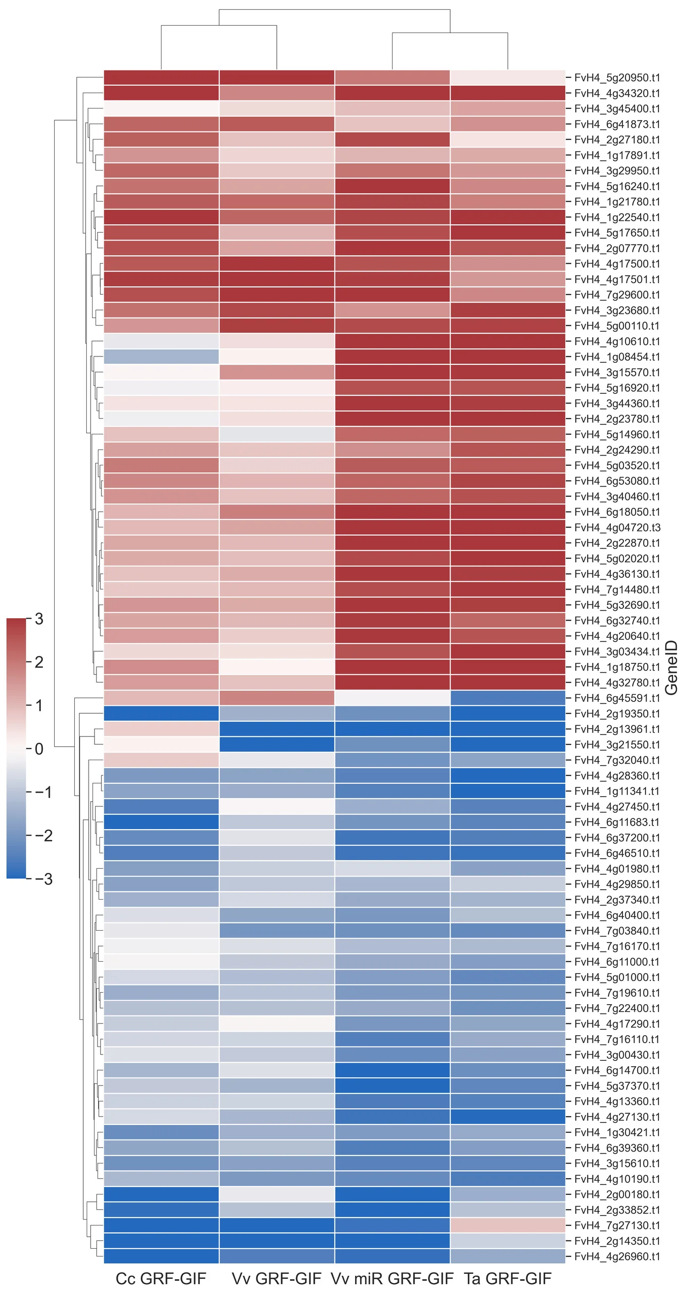
In our recent study published in Plant Methods, we used a heatmap to explore the expression of differentially expressed genes (DEGs) shared across four GRF-GIF chimera lines in the strawberry model organism, Fragaria vesca.
In this post, I’ll explain how I generated the heatmap (seen in Figure 4b), which displays the expression profiles of shared DEGs identified in the 4-way Venn diagram, using a Python and Jupyter Notebook workflow.
Step 1: Setting Up the Environment
First, the following Python libraries were imported:
- numpy and pandas were used to import data and extract shared DEGs.
- matplotlib and seaborn were used to generate the heatmap.
- scipy.cluster.hierarchy was used to determine and reorientate sample clustering.
import pandas as pd
import numpy as np
import seaborn as sns
import matplotlib.pyplot as plt
from scipy.cluster.hierarchy import linkage, dendrogram
Step 2: Gather Data
Our analysis focussed on DEGs from F. vesca lines transformed with GRF-GIF chimeras from citrus (Cc GRF-GIF), grape (Vv GRF-GIF), grape with microRNA perturbation (Vv miR GRF-GIF), and wheat (Ta GRF-GIF).
Following differential expression analysis, I defined variables for each output file containing the log2 fold-change (log2FC) values, as well as the list of shared DEGs identified using a 4-way Venn diagram.
condition1_file = "GRF-GIF_Citris_vs_Control.tsv"
condition2_file = "GRF-GIF_Vitis_miR_vs_Control.tsv"
condition3_file = "GRF-GIF_Vitis_vs_Control.tsv"
condition4_file = "GRF-GIF_Wheat_vs_Control.tsv"
subset_file = "shared_DEG_names.txt"
Step 3: Extracting and Organising Data
Next, I loaded the shared DEG names and iterated through the condition files to extract log2FC values for these genes. The extracted data was compiled into a single dataframe, where rows represented genes and columns represented conditions.
# Create a set of shared DEG identifiers
with open(subset_file, "r") as subset:
    subset_genes = set(line.strip() for line in subset)

# Define empty output dataframe
output_df = pd.DataFrame(columns=["GeneID"])

# Extract the log2FC values for shared DEGs and merge data across conditions
for condition_file, condition_name in zip(
    [condition1_file, condition2_file, condition3_file, condition4_file],
    ["Cc GRF-GIF", "Vv miR GRF-GIF", "Vv GRF-GIF", "Ta GRF-GIF"]
):
    df = pd.read_csv(condition_file, delim_whitespace=True)
    subset_df = df[df["GeneID"].isin(subset_genes)]
    subset_df = subset_df[["GeneID", "log2FC"]]
    subset_df.rename(columns={"log2FC": condition_name}, inplace=True)
    output_df = pd.merge(output_df, subset_df, on="GeneID", how="outer")

# Reorder columns and set GeneID as index
output_df = output_df[["GeneID", "Cc GRF-GIF", "Vv GRF-GIF", "Vv miR GRF-GIF", "Ta GRF-GIF"]]
output_df.set_index("GeneID", inplace=True)
Step 4: Sample Hierarchy Visualisation
To better understand the relationships between conditions, I performed hierarchical clustering on the samples. This clustering helps to visualise how similar or distinct the conditions are based on DEG expression. It also allowed me to reorientate the sample order for consistent visualisation across all panels of the figure.
# Use hierarchical clustering to establish sample relationships
link = linkage(output_df.T)
_ = dendrogram(link)

# Adjust sample order for intuitive visualisation
link[2][[0, 1]] = link[2][[1, 0]]
_ = dendrogram(link)
Step 5: Generating the Heatmap
Finally, I visualised the shared DEG expression profiles using a clustered heatmap. The heatmap provides insights into expression patterns, highlighting upregulated and downregulated clusters.
Key parameters:
-
cmap="vlag": Divergent color scheme for highlighting up/downregulation. -
center=0: Center the color scale at zero to distinguish positive and negative log2FC values. -
dendrogram_ratio: Adjust the ratio of dendrogram to heatmap size for readability. -
row_cluster=True: Cluster genes to reveal groups with similar expression patterns.
sns.set(font_scale=1.1)
shared_heatmap = sns.clustermap(
    output_df, center=0, cmap="vlag", vmin=-3, vmax=3,
    dendrogram_ratio=(.1, .05),
    row_cluster = True, col_linkage=link,
    cbar_pos=(-0.05, .32, .03, .2),
    linewidths=.75, figsize=(10, 20)
)

shared_heatmap.cax.tick_params(labelsize=18)
shared_heatmap.ax_heatmap.set_ylabel("GeneID", fontsize=18)
shared_heatmap.ax_heatmap.set_xticklabels(shared_heatmap.ax_heatmap.get_xticklabels(), fontsize=18)

shared_heatmap.savefig('Shared DEGs Heatmap.tif', dpi=300, bbox_inches="tight")
Results
The resulting heatmap revealed distinct clusters of genes with differentially shared expression across the four GRF-GIF lines. This visualisation provided a critical bridge between the 4-way Venn analysis and functional characterisation of shared DEGs.

Summary
This step-by-step approach demonstrates how Python can streamline the process of DEG visualisation, from raw data to polished heatmaps. The insights gained through this analysis helped drive our understanding of GRF-GIF-mediated gene regulation.
Explore the full notebook and other code from our paper in my GitHub repository.
Support
If you find this blog post helpful, please consider buying me a coffee on Ko-fi. Your support is very much appreciated!
Enjoy Reading This Article?
Here are some more articles you might like to read next: