Visualising Differentially Expressed Genes with Upset Plots
Upset plots are a useful alternative to Venn diagrams for visualising intersections between multiple sets of data.
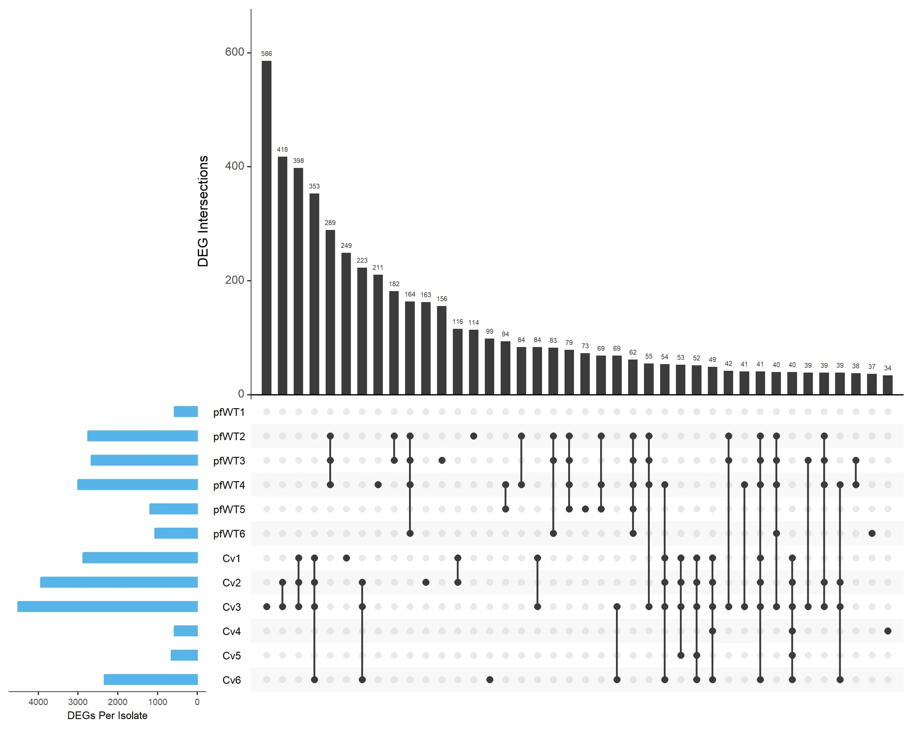
In our recent study published in Fungal Biology and Biotechnology, we used an Upset plot to explore the overlaps in differentially expressed genes (DEGs) across 12 isolates of the mycoprotein fungus Fusarium venenatum.
In this post, I’ll explain how I generated the plot (seen in Figure 3A) using R, which displays the shared DEGs identified by our RNA-seq analysis.
When to Use an Upset Plot Over a Venn Diagram
While Venn diagrams work well for a small number of datasets (typically up to 3-4), they become increasingly complex and unreadable with additional sets. That’s where Upset plots come in!
Upset plots display the size of each set and the frequency of overlapping elements in a clear and structured way, making them particularly useful when dealing with more than 4 sets.
Generating Upset Plots Using R
Below is an example workflow for generating Upset plots using DESeq2 results.
This process involves loading in the DEG lists from multiple conditions, structuring them into a format suitable for visualisation, and finally generating the Upset plot.
1. Install and Load Required Packages
First, you’ll need to install and load the required R packages. These include plyr and reshape2 for data manipulation, and UpSetR for visualisation. The sessionInfo() function can be used to check the currently loaded packages and ensure all dependencies are available.
BiocManager::install(c("plyr", "reshape2", "UpSetR"))

library(plyr)
library(reshape2)
library(UpSetR)

sessionInfo()
2. Import and Process Data
Next, we load the DEG lists extracted from DESeq2 results. These lists contain gene names from the different isolates filtered based on an FDR threshold (i.e. FDR < 0.05).
filelist = list.files(pattern = "*names.txt")
We then create a structured table containing set names, gene identifiers, and a binary presence indicator.
res <- lapply(filelist, function(x) {
 data.frame(
  set = x,
  geneID = as.character(read.table(x)[,1]),
  val = 1)
})

res <- ldply(res)
The data is transformed from long format to wide format, ensuring gene names are row identifiers and removing file extensions from column names.
res1 <- acast(res, geneID ~ set, value.var = "val", fill = 0)
res1 <- as.data.frame(res1)
res1$name = rownames(res1)
colnames(res1) <- gsub("_DEG_names.txt$", "", colnames(res1))
3. Generate Upset Plot
We then generate the Upset plot that combines data from all 12 isolates (six from the pfWT condition and six from the Cv condition). The upset() function is used with the following arguments:
-
setsspecifies which datasets to include in the plot. -
sets.bar.colordefines the colour of the set size bars. -
mainbar.y.labelandsets.x.labelcustomise axis labels. -
order.byensures intersections are sorted by frequency. -
empty.intersectionsdetermines whether empty intersections are displayed. -
mb.ratiocontrols the relative size of the intersection and set size bars. -
keep.ordermaintains the order of sets as specified. -
text.scaleadjusts the size of various text elements in the plot.
upset_all <- upset(res1, sets = rev(c("pfWT1", "pfWT2", "pfWT3", "pfWT4", "pfWT5", "pfWT6",
                   "Cv1", "Cv2", "Cv3", "Cv4", "Cv5", "Cv6")), sets.bar.color = "#56B4E9",
                   mainbar.y.label = "DEG Intersections", sets.x.label = "DEGs Per Isolate",
                   order.by = "freq", empty.intersections = "off", mb.ratio = c(0.55, 0.45),
                   keep.order = TRUE, text.scale = c(1.3, 1.3, 1, 1, 1.2, 0.85))

print(upset_all)
4. Export Upset Plots
Finally, export the plot as a high resolution PNG files.
png("upset_plot_all.png", width = 10, height = 8, units = "in", res = 300)
print(upset_all)
dev.off()
Results
The resulting Upset plot revealed a minimal overlap in differentially expressed genes across the two groups of isolates. This allowed us to then perform gene ontology analysis on these groups separately to identify specific enriched pathways in each group.

Summary
Upset plots provide a clear visualisation of DEG overlap across multiple conditions, overcoming the limitations of Venn diagrams for complex datasets. This approach allows us to better understand patterns of gene expression changes across multiple experimental conditions.
If you’re interested in learning more about our results, you can read the full paper in Fungal Biology and Biotechnology. Otherwise, feel free to adapt the visualisation for your own datasets and explore the intersections within your gene sets.
Support
If you find this blog post helpful, consider buying me a coffee on Ko-fi. Your support is very much appreciated!
Enjoy Reading This Article?
Here are some more articles you might like to read next: